

How would you like a 71% increase in engagement on your homepage?
That’s the outcome we’ve achieved for MyGug, by implementing a new homepage chock full of strategic persuasion techniques intended to keep their ideal prospects interested.
Each technique is one you can easily grab for your own homepage, once you know what they are and how they work.
But first, how did the business even know it was time for a homepage refresh?
When MyGug got their original website done, they were a brand new business with a brand new product.
They had zero market awareness, and had yet to identify their target market or their value proposition.
Fast forward a couple of years, and they’d taken huge strides in defining who they’re for and what they offer.

They’d narrowed it down to two target markets: farm-to-fork food businesses and educational settings (which I’ll call ‘schools’ from here on to keep it simple).
And they’d gotten clear on how they serve those markets.
But their website’s homepage didn’t represent any of that.
As MyGug’s CEO, Fiona Kelleher, put it, ‘It felt like a mismatch to the great work happening and interest in our offering. It gave a bad impression and feedback was negative.’
Clearly, a homepage refresh was due. Which isn’t necessarily as simple as it sounds.
The awkwardness of the homepage…
Homepages are tricky beasts.
They pretty much require you to break the top three commandments of copywriting:
1. Write for one reader.
2. Write for one Stage of Awareness.
3. Focus your one reader on one action.
On a landing page or sales page you have more control. You can finetune your messaging for one specific reader, with one specific goal, in one specific phase of the Customer Journey. All of those are known variables to you.
But on a homepage, you get all sorts arriving.
The challenge is to account for all those sorts. Show each of them the right message at the right time. And get them to where they need to be on your site.
And you have to do it in a way that stops them from bouncing before they get there.
Like I said… tricky.
But get your homepage right?
And instead of a fleeting visit, you could nurture a lasting engagement that directly influences conversions and customer retention.
There’s a lot of opportunity to make a stellar first impression on your homepage… if it has the right elements in place.
Let’s explore some of those elements now.
Allow me to bring you:
6 underutilised but highly effective persuasion techniques we used on the MyGug homepage – that you can steal for your own.
1. Your main headline should meet people where they are
Thanks to marketing research for an earlier project, Frank and I knew MyGug’s ideal prospects were late Problem Aware/early Solution Aware.
Or in other words…
Their prospects knew the ins-and-outs of the problems food waste created in their lives.
And they were aware of the alternative solutions (such as cutting down on overall food waste, using a brown bin service or on-site composting…), but no one had ever heard of/considered micro anaerobic digestion as a solution before.
So that information right there informed the main headline of the homepage refresh.
Our goal is to meet the reader exactly where they are when they arrive on the page.
Which is where?
It’s thinking about food waste, convinced it’s a problem.
So we make that connection straight away in our headline. And we just go ahead and call it what it is in the prospect’s mind: a problem. Because you should never be clever when there’s the chance to be clear:
‘Turns out your food waste “problem” is actually a…’
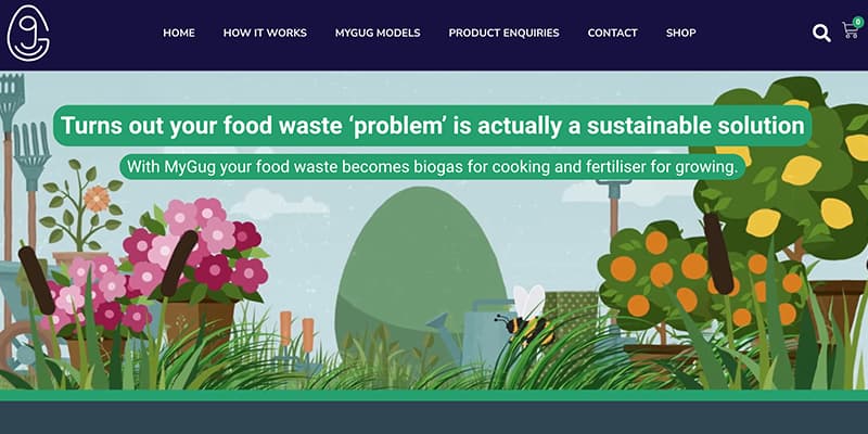
But in the same headline we flip the script. We position food waste as a ‘sustainable solution.’
This is our headline hook.
Any prospect who has ever thought of food waste as a problem (which is all of them, according to our research) is jarred into paying attention when they see it being called a sustainable solution.
And that’s how our main headline gets the ideal prospect paying attention and wanting to learn more.
Your takeaway: Craft a homepage headline that hooks your reader and meets them exactly where they are.
2. Your social proof should enhance the persuasiveness of your messaging
There are two things you need to remember about social proof on a homepage:
- It should be there.
- Where you put it matters.
But first – what is social proof?
It’s any element that taps into the psychological phenomenon of ‘herd mentality.’ Or, our irresistible human tendency to base our behaviour on that of others.
Some common forms of social proof are:
- Testimonials
- Case Studies
- Celebrity/Influencer Endorsements
- User Numbers
- Reviews and Ratings
But no matter what form it shows up in, social proof is always a form of third-party proof.
It’s the difference between a brand saying to you ‘Try us! We’re great!’ and your friend saying ‘Try them! They’re great!’ (Who are you going to trust more?)
Now, it’d be incredible if you could ensure that every prospect who arrives on your site was met with social proof from one of their friends. But alas, not possible.
So here’s what you do instead:
You provide social proof from a source that your prospect either a) implicitly trusts or b) relates to.
We went with option b for the MyGug homepage.
We used testimonials from a food business owner and a school representative (if you’ll recall, MyGug’s two target markets).
And we included benefit-driven quotes from – you guessed it – a café owner and a school chef, that link to case studies.

Remember how I said the location of social proof matters?
We didn’t just slap this social proof down anywhere we felt like it. Oh no. We were incredibly intentional about it.
On a webpage, the job of social proof is to increase the credibility and persuasiveness of the surrounding messaging.
That’s why our target-market testimonials show up directly beneath the first appearance of our main Calls to Action.
And our case study quotes show up at the point on the page when the reader is thinking ‘this all sounds great, but how exactly will it benefit me?’
Your takeaway: Use social proof. Be intentional about it.
3. Your believability boosters should build authority
Your first time hearing this term?
It’s pretty simple…
A believability booster does what it says on the tin. It boosts the believability of your messaging.
Wait a sec. How’s that different from social proof?
I’m glad you asked…
The main difference is that social proof is… well, social. It refers to the actions and opinions of others to build trust.
Whereas believability boosters draw upon factual evidence and formal endorsements to lend credibility to your messaging.
Which means that when done right, believability boosters will not only boost the credibility of your messaging, but will build your authority too.
Some common forms of believability boosters are:
- Data and Statistics
- Certifications, Recognitions and Awards
- Media Mentions
- Recognised Authority/Industry Leader Endorsements
- Scientific Backings
Basically, believability boosters reassure the reader whenever they start asking ‘is this something I can trust?’
MyGug is bringing to the market a tech product that’s unfamiliar to most people. So we’ve got our work cut out for us, putting their naturally suspicious minds to ease. Which means on this homepage, believability boosters abound (please, try saying that 5 times fast).
So we start with an easy, but powerful one:
A proof bar of press logos.
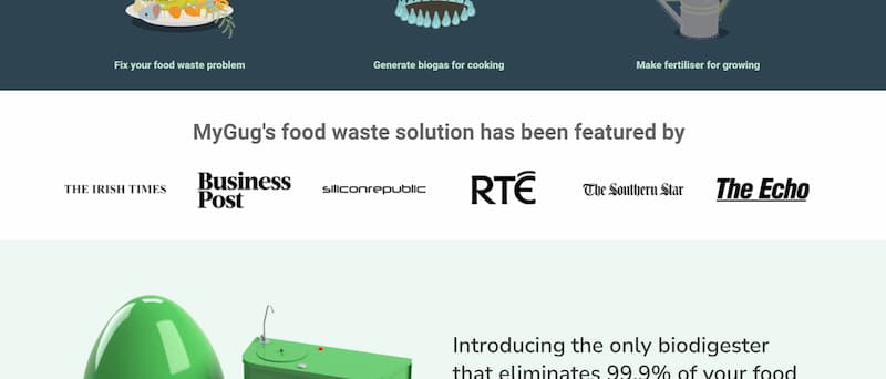
We intentionally placed this particular proof bar near the top of the page, just below the hero section. It makes an early impression on the reader – ah, so they’ve been featured in publications I already know and trust.
(See how, just like with social proof, location matters?)
We have two more logo-based proof bars on the page. One for awards and recognition, and the other for funding sources.
We knew these logo sets wouldn’t be as widely recognisable as the press logos, but they still lend powerful authority. So they show up farther down the page, once the reader is more invested.
The screenshot of the dashboard is another believability booster. We could simply tell the reader they’ll always know exactly what’s going on inside their MyGug. But why stop there when we can show them how that’s true?

We also have a fourth, not entirely conventional proof bar, that acts as a believability booster…
It’s the section that links to specific blog posts. In this bar, we made sure to include blog posts that go into the science behind the MyGug unit. Because facts = believability.
Your takeaway: Your prospects are on the lookout for a reason not to believe you. It’s up to you to anticipate their suspicions and address them on the page with believability boosters.
4. Yes – you should put agitation on your homepage
Agitation on a homepage? That’s different.
^ What I imagine someone saying who’s heard of the Problem-Agitation-Solution copywriting framework, but has yet to explore its full potential.
Yes, agitation belongs on your homepage. Near the top.
Why?
Because it keeps your reader reading.
Your headline hook hooks them. Agitation keeps them moving down the page.
But the reality is agitation is perhaps one of the most misunderstood, underappreciated techniques in marketing.
I suspect that’s because when it’s maliciously misused, it’s manipulative.
BUT when it’s properly used, agitation is one of the most empathetic gestures you can show your prospect.
Let me explain…
Agitation is your opportunity to prove to your prospect – Hey, I get you. I understand where you’re coming from. I’ve made the effort to get to know you and what you’re going through so vividly and so deeply, that I can reflect it back to you.
There’s nothing heartless or exploitative about that.
So for the MyGug homepage, our task was to agitate the prospect’s problem that we’d acknowledged in our hero headline – that food waste is a problem.
We do that by highlighting some shocking food waste statistics, tailored for the two target markets (food biz and schools).
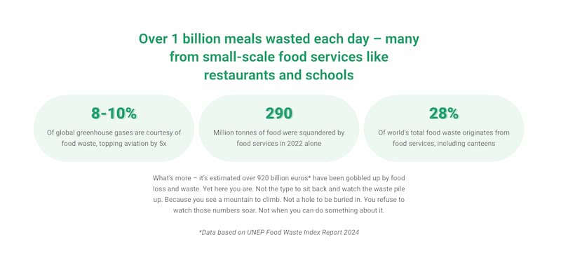
Then we transition from agitating the problem, to agitating the reader’s emotions and sense of responsibility. Ultimately, this section is a “call to arms”.
It amplifies the problem’s urgency and importance, and gets the reader to nod along, because they identify as the type of person who will “do something about it”.
(Bonus insight: This “nodding along” also taps into the persuasion principle of consistency, as Robert Cialdini writes about in Influence: The Psychology of Persuasion. When you get someone to self-identify as a certain type of person, they want to remain consistent to that identity. So they’ll be more open to committing to the solution you offer.)
Your takeaway: Give yourself a huge opportunity to connect with your reader early on the page by effectively – and ethically – using agitation.
5. You should make your copy emotional
You think emotion and tech products don’t mix?
You obviously haven’t met Talia Wolf.
Her whole career is based on showing traditionally “dry brands” (in her case the focus is B2B) how emotion-based marketing does wonders for conversions.
After all, research has shown that our emotions are what drives our decisions, and that includes purchasing decisions. Logic has its part to play too. Second fiddle though – we use logic to justify the decision once it’s made.
So with emotion playing lead in the decision-making process, it would be supremely unwise to leave it out of your copy.
Even when the offer is as scientific-sounding as a micro-scale anaerobic digester unit, there’s emotion to be mined there.
Here’s where we tap into the power of emotion on the MyGug homepage:
Agitation Section: As discussed above, this section agitates the reader’s emotions that arise from wanting to do the right thing for the environment.
Value Proposition Crosshead: A major intangible benefit of owning a MyGug is the pride you feel from doing your part. How do we convey that to the reader? By pretty much saying exactly that.
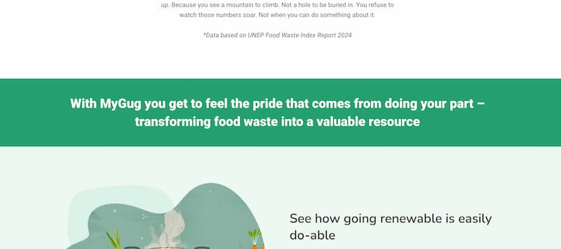
Future Impact Theme: This theme of making a positive contribution to the future weaves throughout the page and directly supports the “pride” messaging in the Value Proposition headline.
Your takeaway: Don’t overlook the power of exploring the real emotions people feel when they experience your solution. It helps guide them along the decision-making process.
6. You shouldn’t ignore urgency on the page
Let’s get one thing clear – urgency doesn’t begin and end with disappearing offers and countdown timers.
There’s way more to it than pressure tactics.
At its core, urgency taps into two main drives:
- The urgency of acting now to gain something valuable
- The urgency of acting now to avoid losing something desirable
Both are potent, appealing to different aspects of human motivation.
A good way to harness these more subtle, but deeply meaningful, forms of urgency is to use Future Pacing.
This technique involves helping your audience visualise the positive future they can achieve through immediate action, or the negative consequences of inaction.
For MyGug, this means highlighting the environmental benefits of reducing food waste today as opposed to tomorrow.
In the close of the MyGug homepage, we put forth that each day wasted is a missed opportunity in the fight against climate change, thus creating a subtle yet powerful urgency.
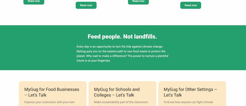
We also nudge the reader with the question “Why wait to make a difference?”
We’ve used the entire page to talk about the possibility of a better future. Now we’re highlighting the urgency around the need to act now to make that future happen.
Your takeaway: Don’t let your reader slip into the ease of failing to take action. Figure out what they care about and build urgency around that on your homepage.
‘We are now proudly sharing the page’

So a lot of thought and work went into the new MyGug homepage but… was it worth it?
Well, the 71% increase in average engagement time on page is a good indication that it was.
But to add to that, we’ll take our own advice about social proof and let Fiona, the CEO, tell you herself:
We are now proudly sharing the page (a new experience), and the feedback has been great. With many questions answered, those who visit the site are more advanced in the sales discussion than before. The new page reassures the visitor about the quality and integrity of the product and the business, which is key to our growth.
So if you feel your homepage could do with a boost in persuasive power, consider how you can implement these 6 underutilised but highly effective techniques.
Or get in touch with us for a chat about how we can do it for you.
Either way, It’ll help you make a great first impression that’s more likely to turn into a lasting impression.
